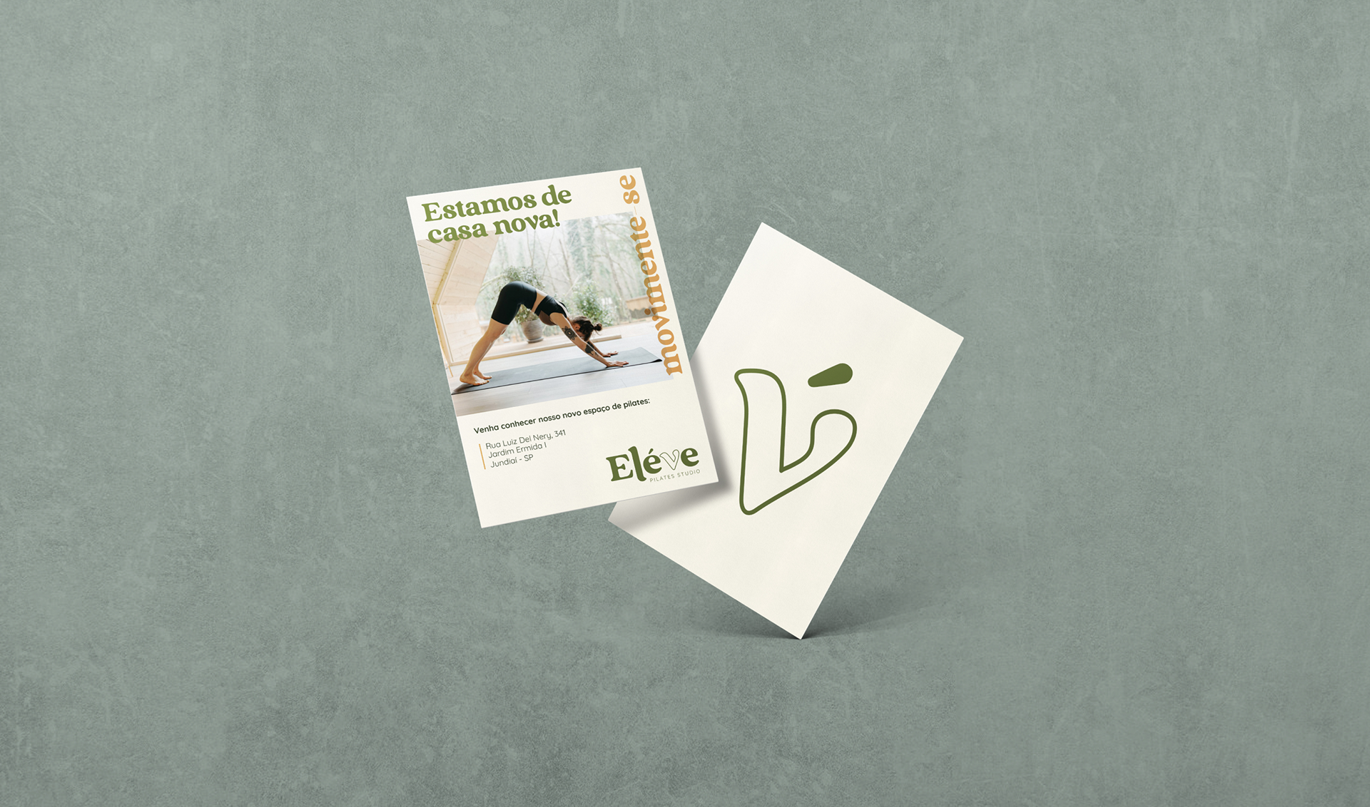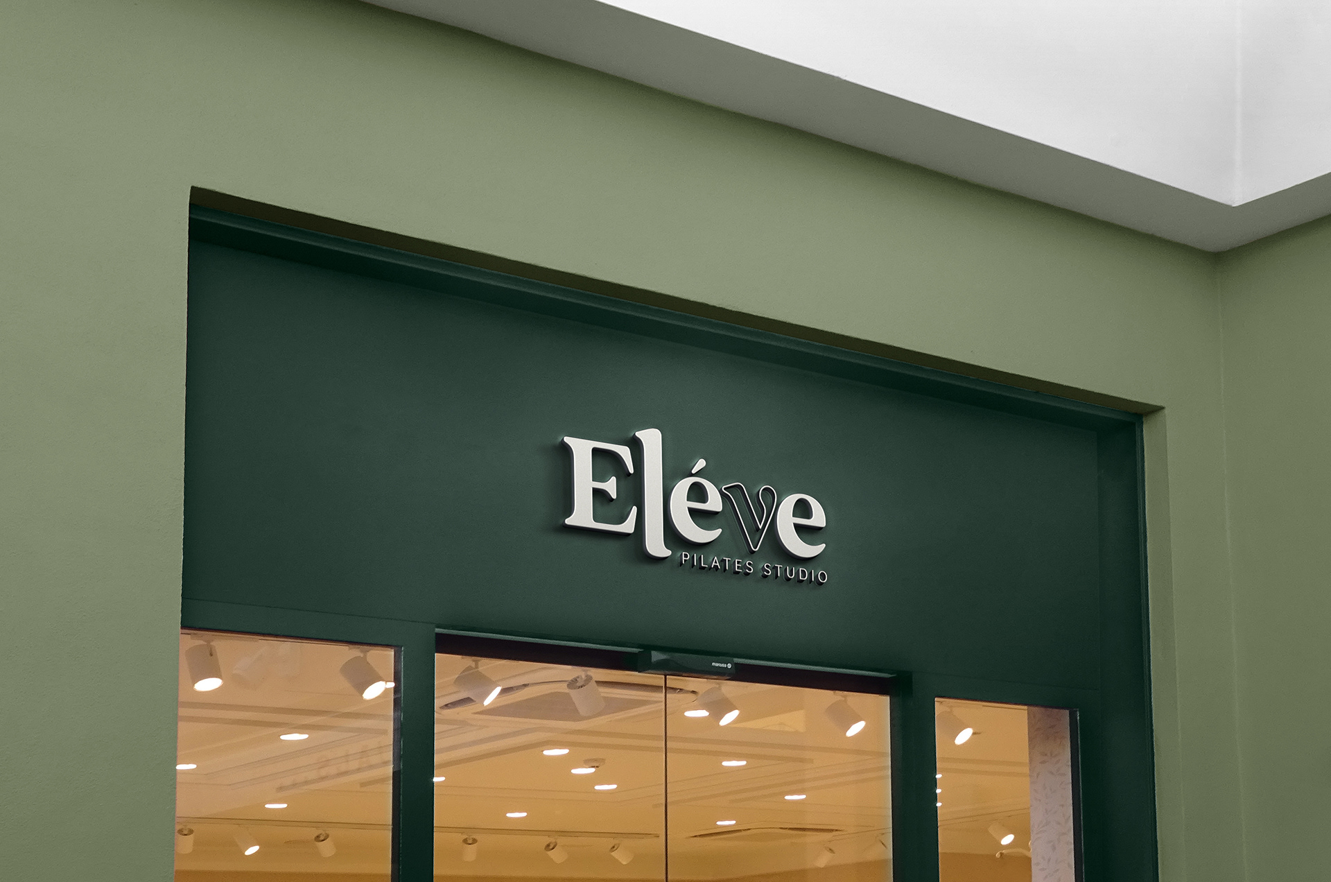
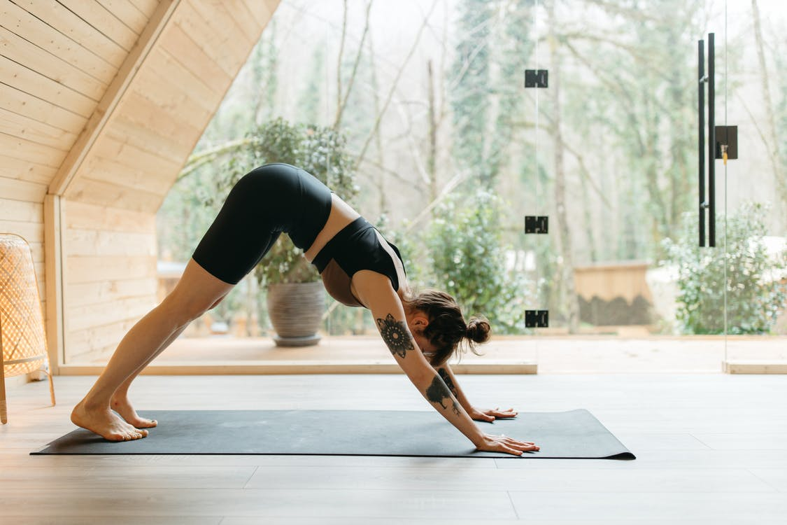
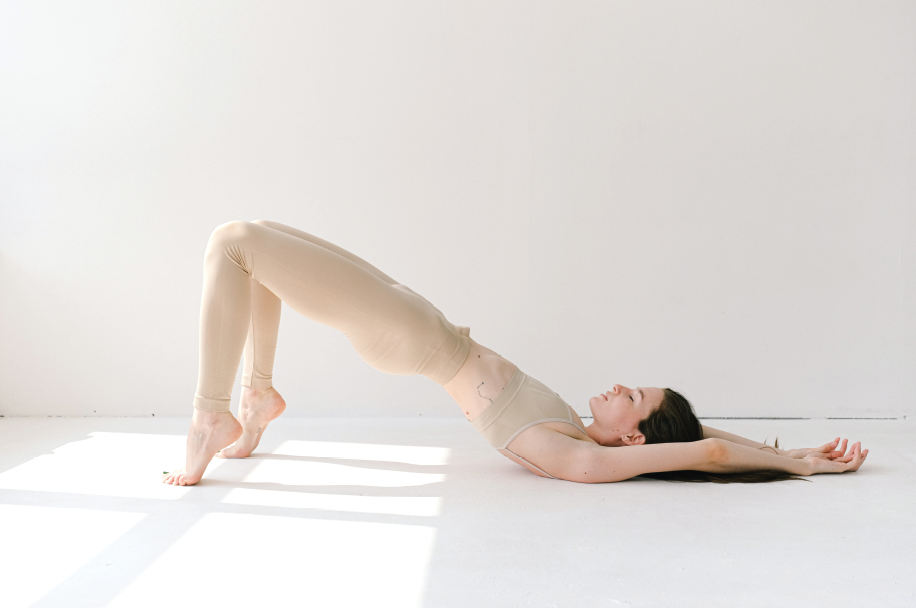
Eléve is a brand that despite being on a born process, has loyal clients. Its purpose is to bring pilates to people as a daily exercise and not just a physiotherapeutic way of treating injuries.
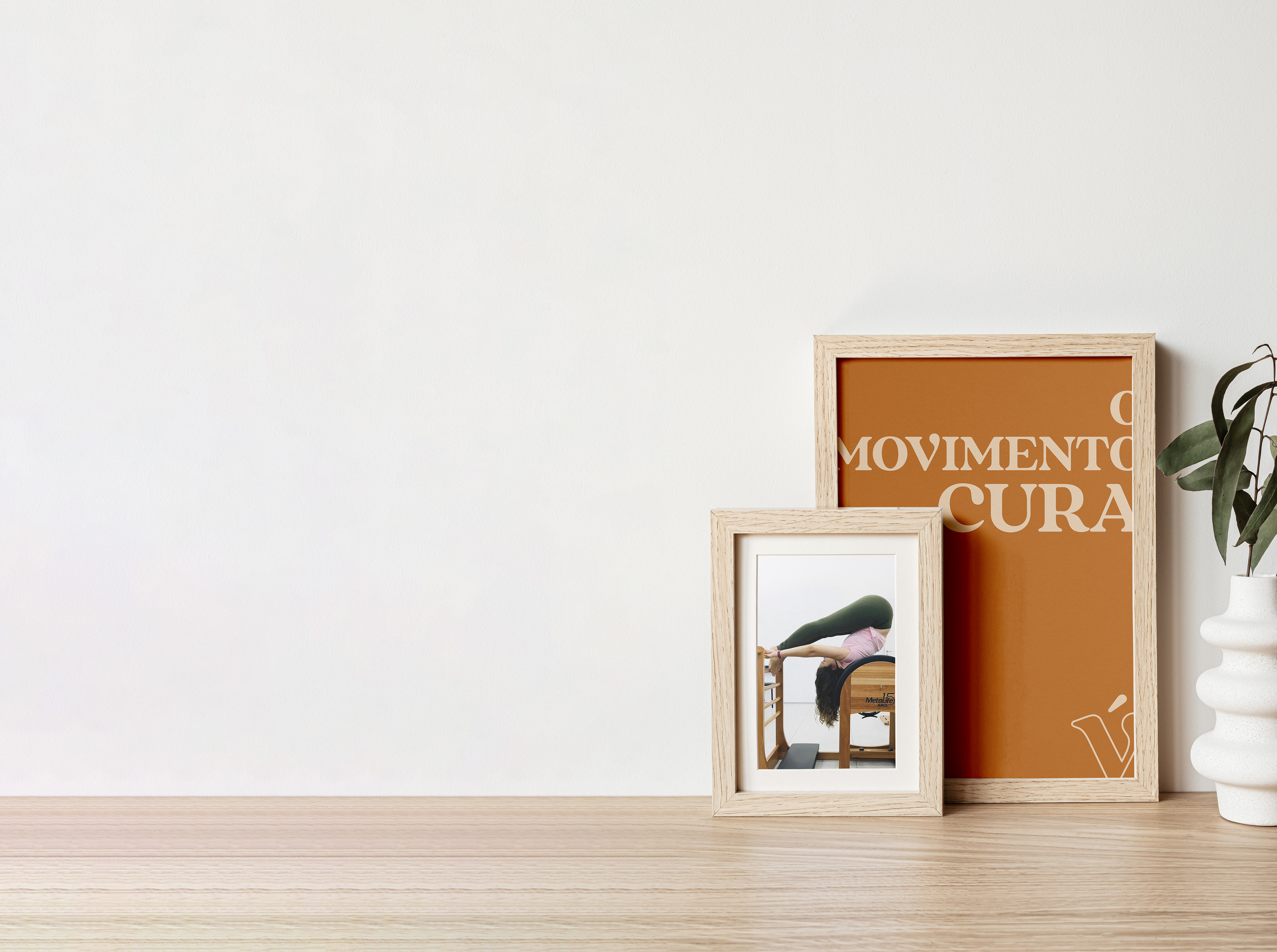
The company has simplicity, attractiveness and humanity as its three basic pillars, bringing comfort and reliability to the service provided. The digital presence will be a way to interact with students, focused more on photos and notices.
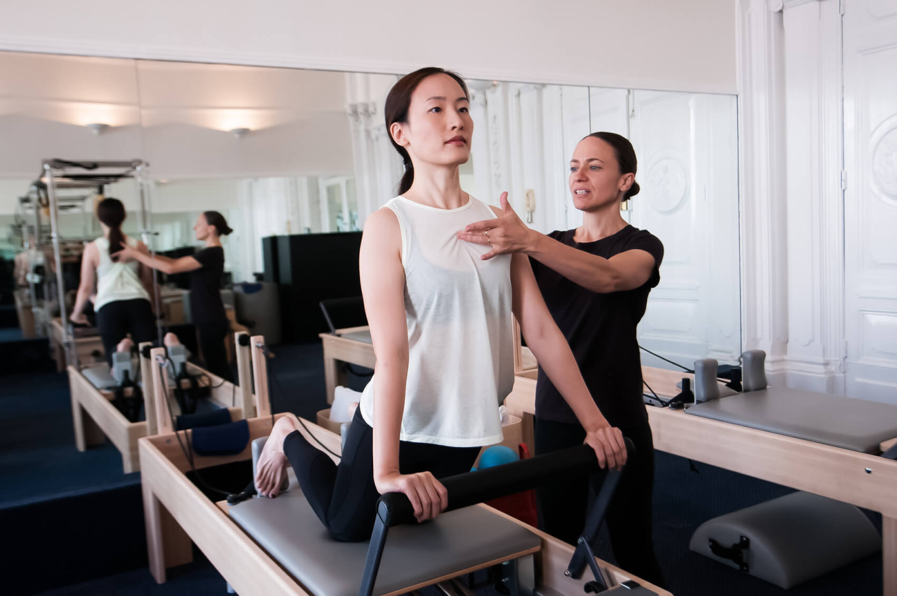
In the future, it aims to increase the space to have more classes in groups, as a mean of stimulating interaction between students.
simple human atractive light happy elegant
moodboard:
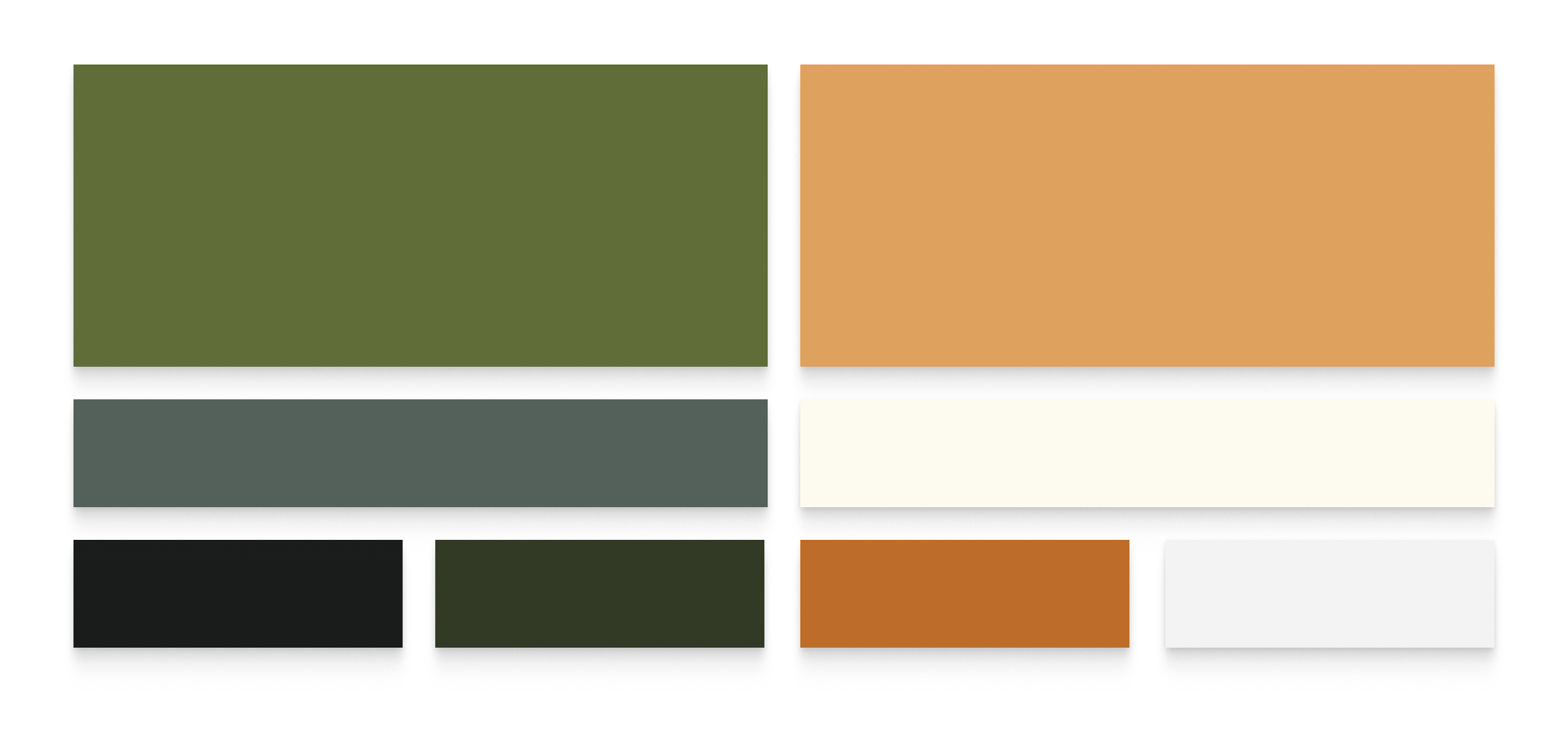
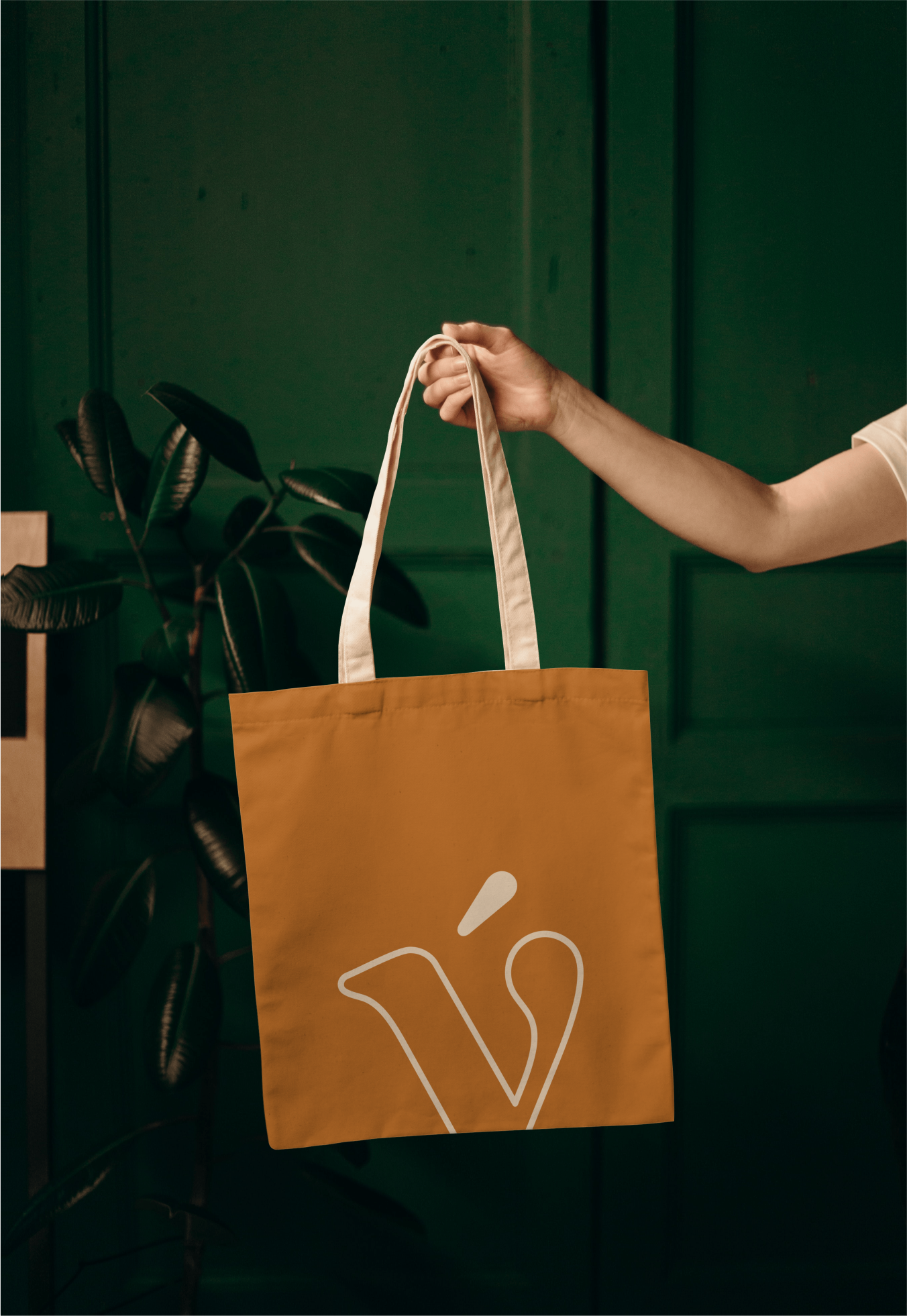
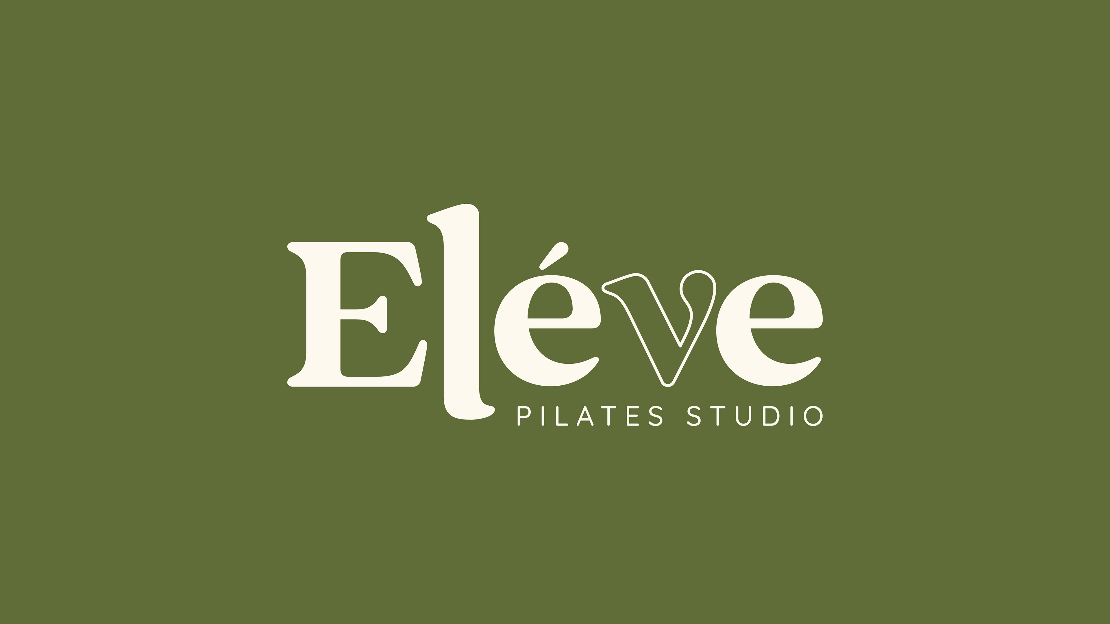
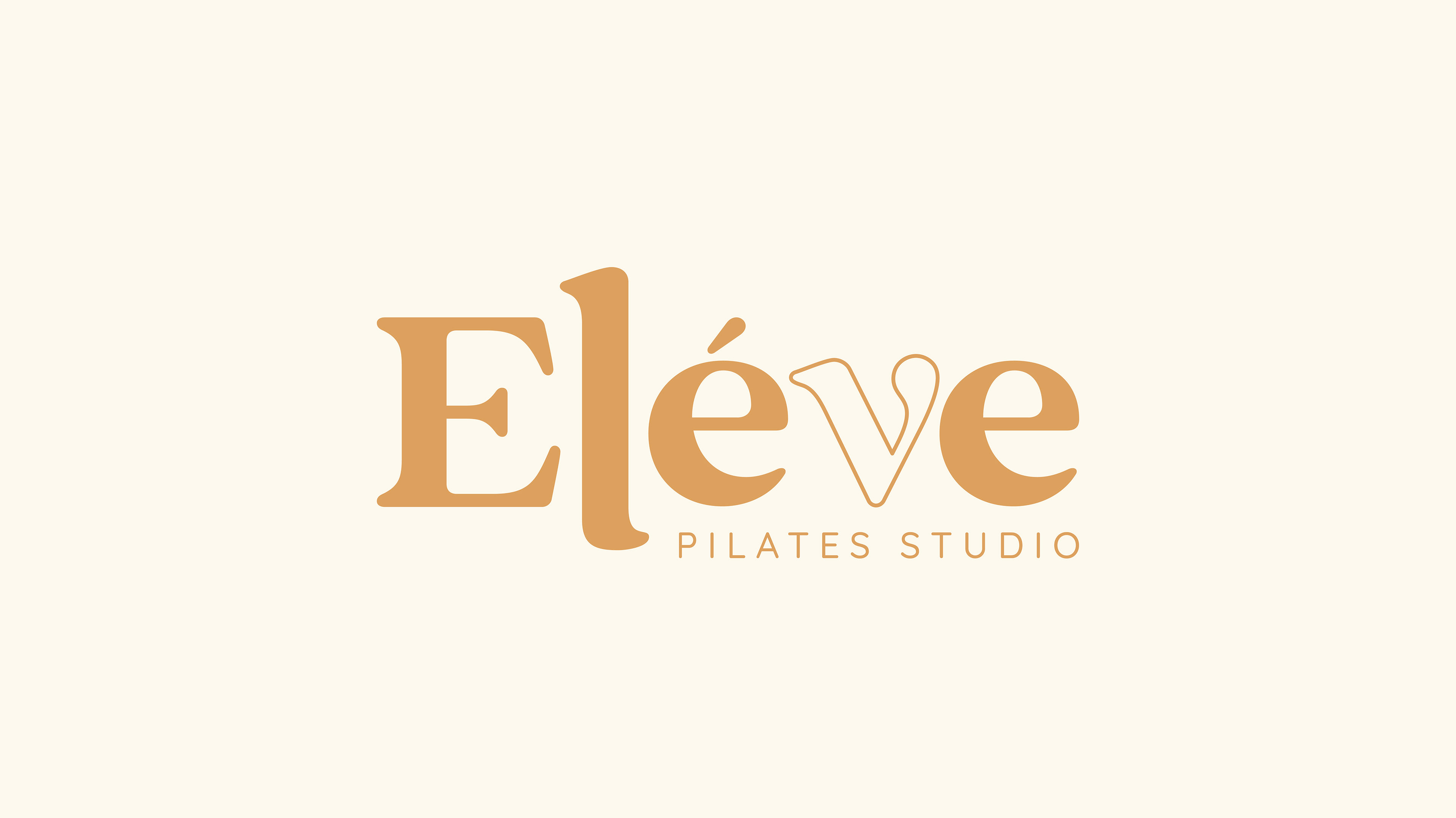
Eléve's colors reflect the aspects that the brand wants to convey: simplicity, humanity and attractiveness.
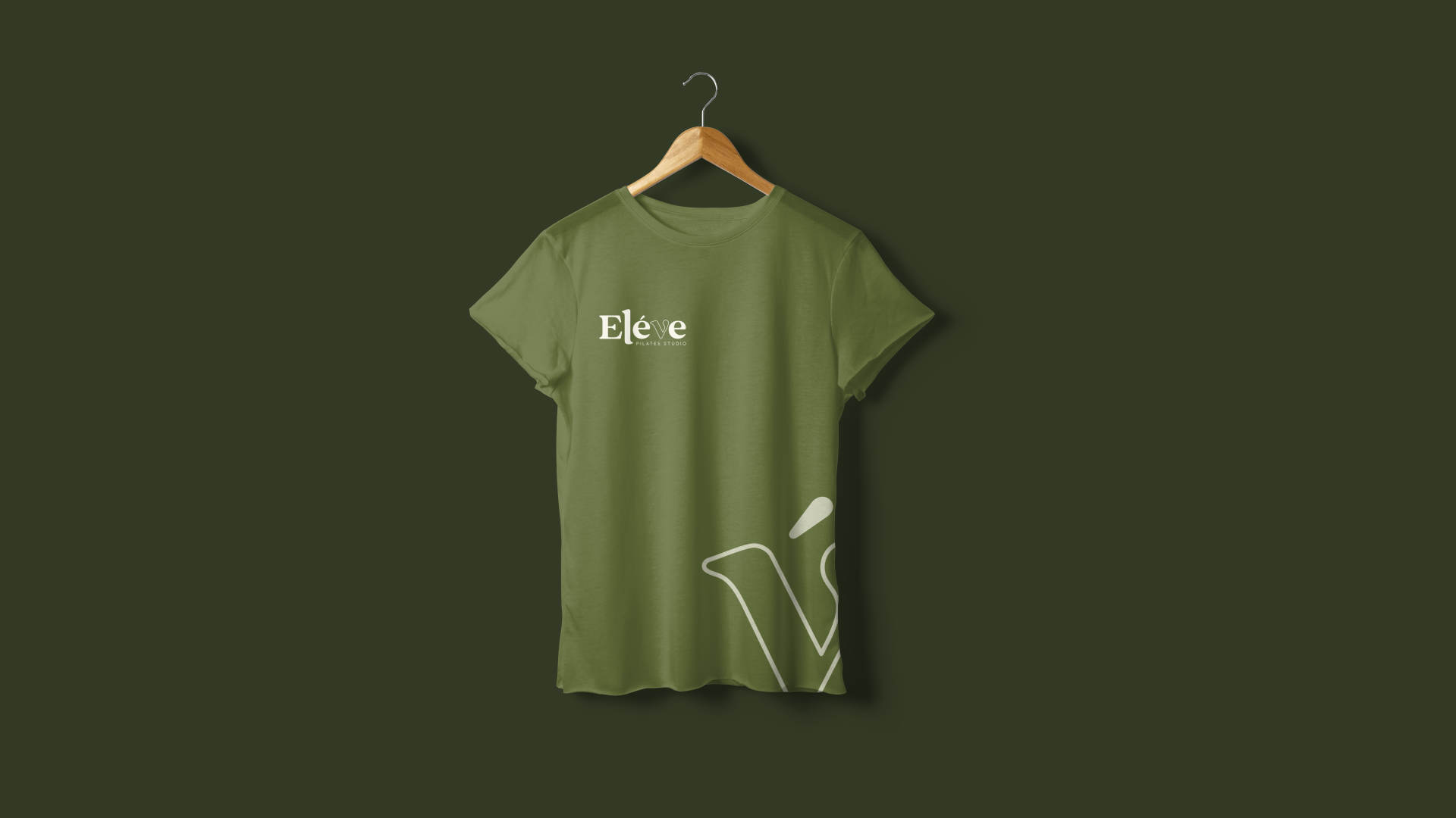
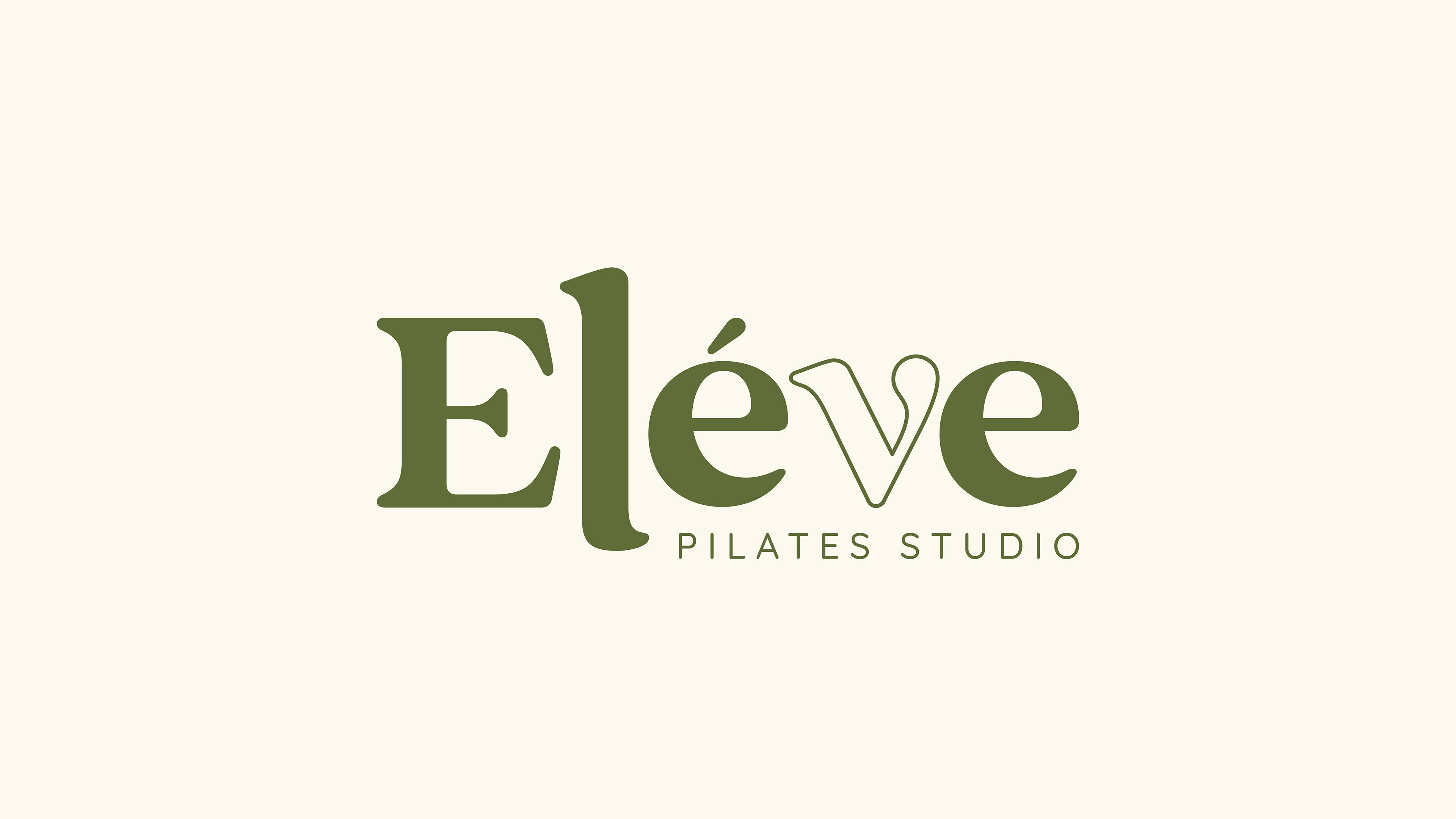
After evaluating the competitors, the green color in a more olive tone was chosen to differentiate it from the others, along with the woody beige that refers to the tone present in pilates equipment.
As secondary colors, a darker shade of green and a more caramel tone will complement future materials.
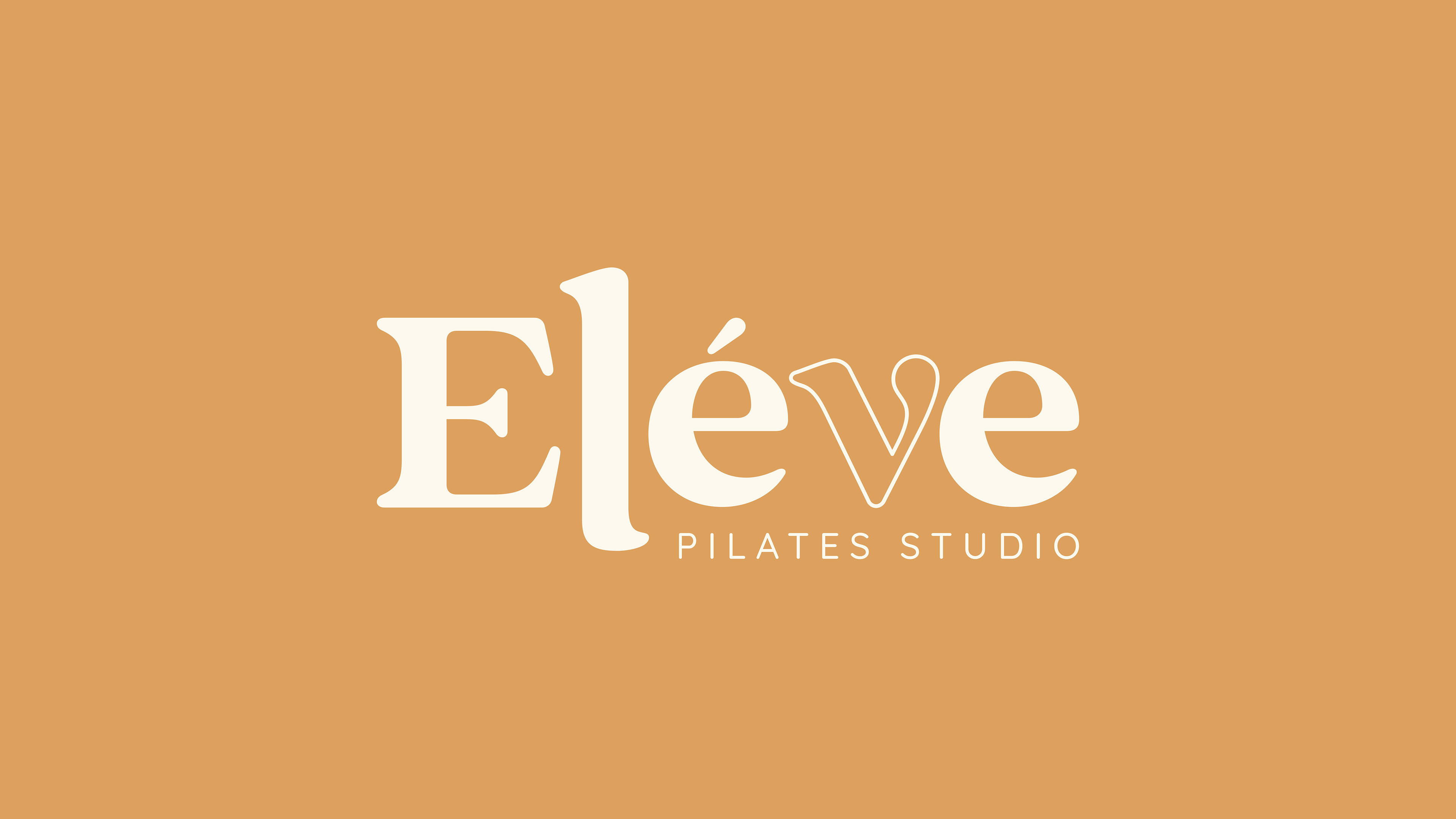
All conceptualized in being a name brand, the choice of typography was a very important decision for the conception.
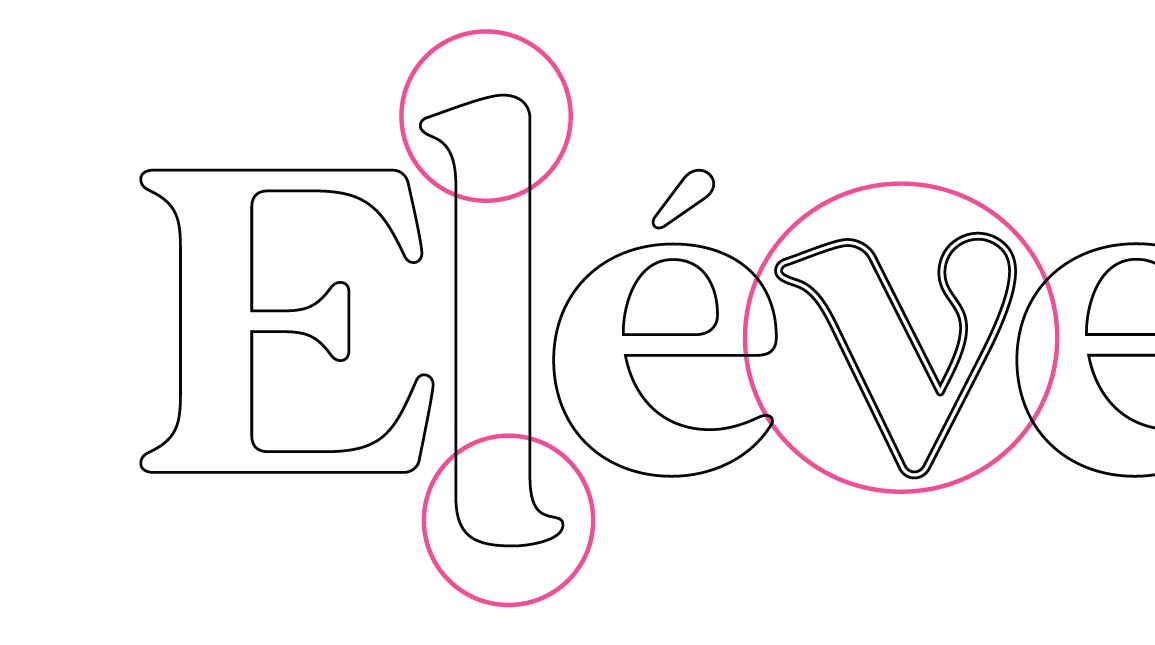
Some optical adjustments were made for the brand to fit the segment. The letter “L” was elongated up and down, surpassing some predetermined limits to convey the idea of stretching – extremely present in pilates. The letter “V” in outline abstractly indicates the “Hundred” pose in the pilates Reformer apparatus, which consists of lifting the trunk and legs simultaneously.