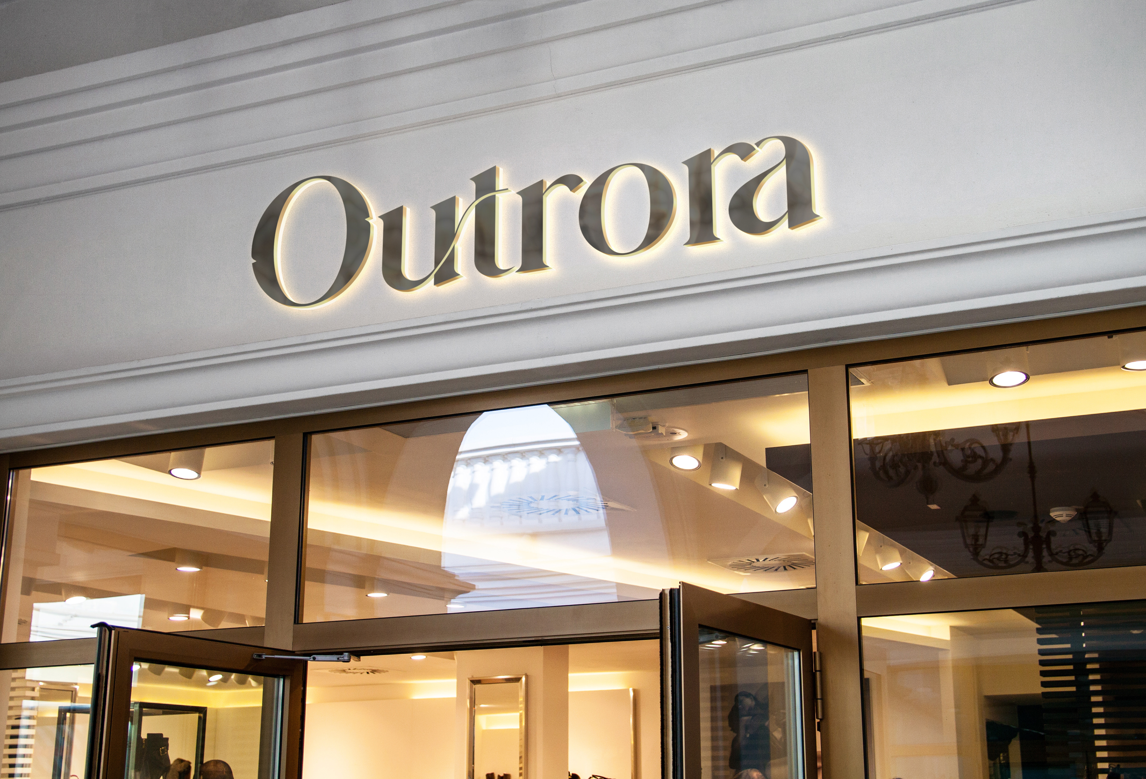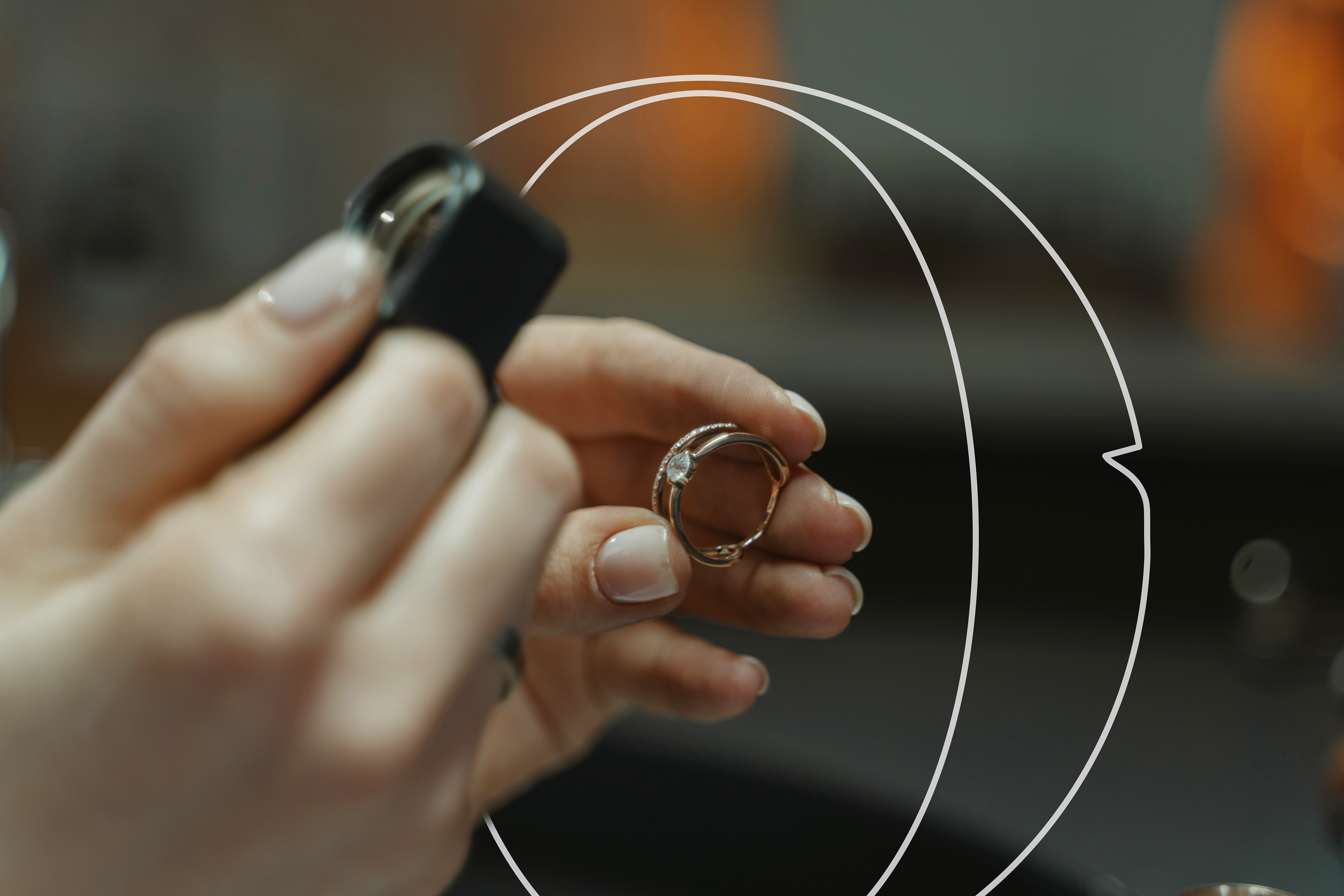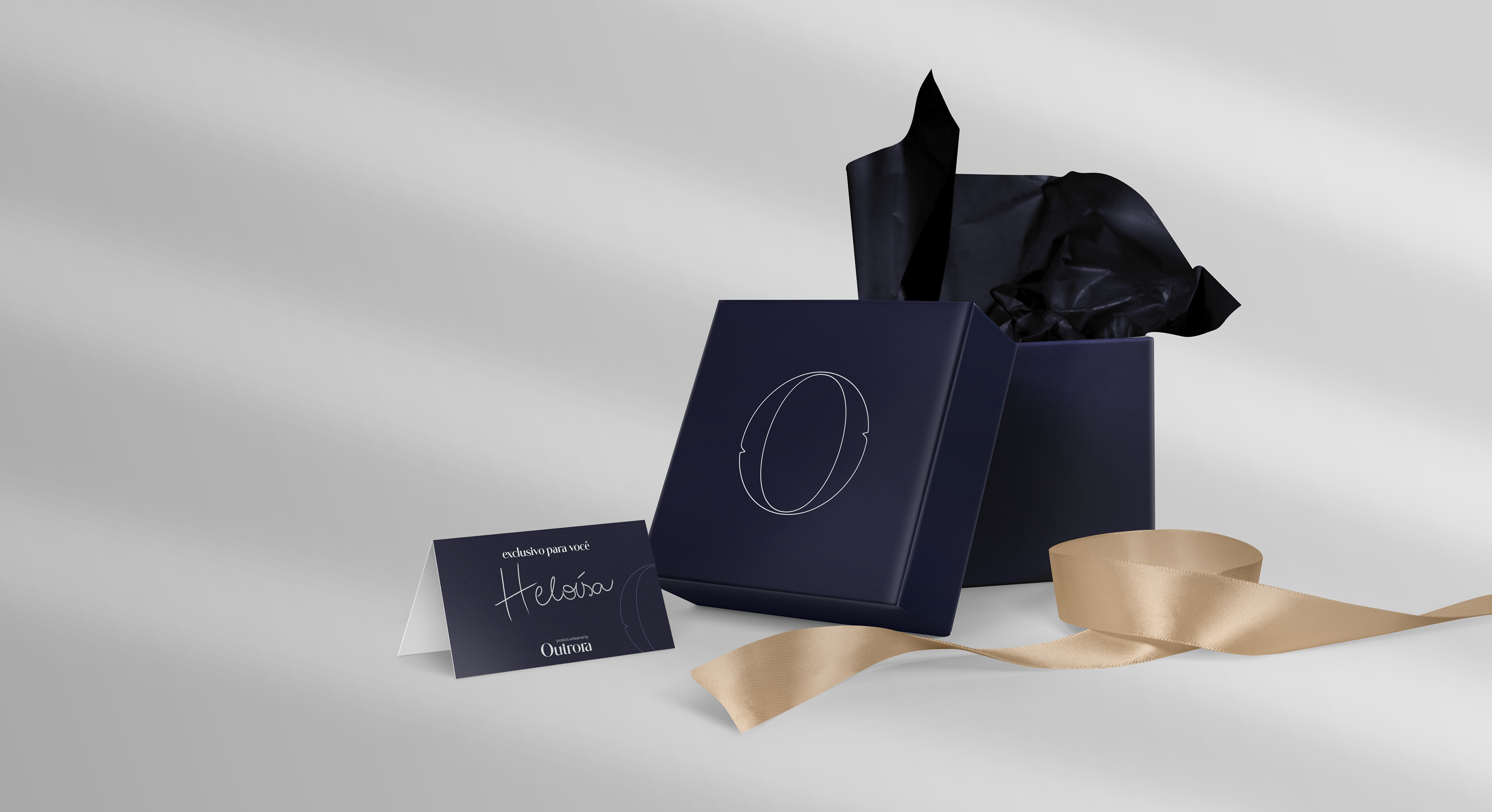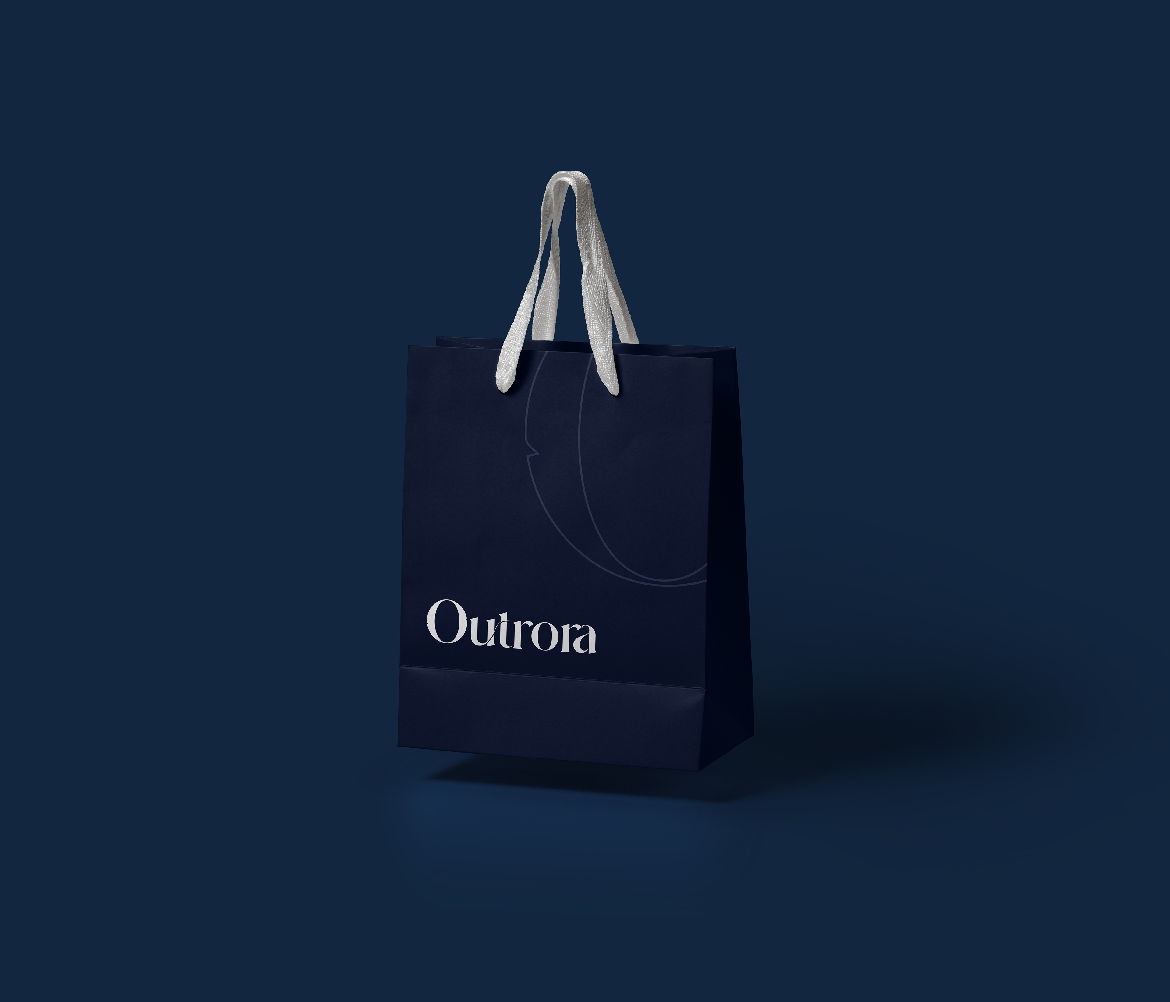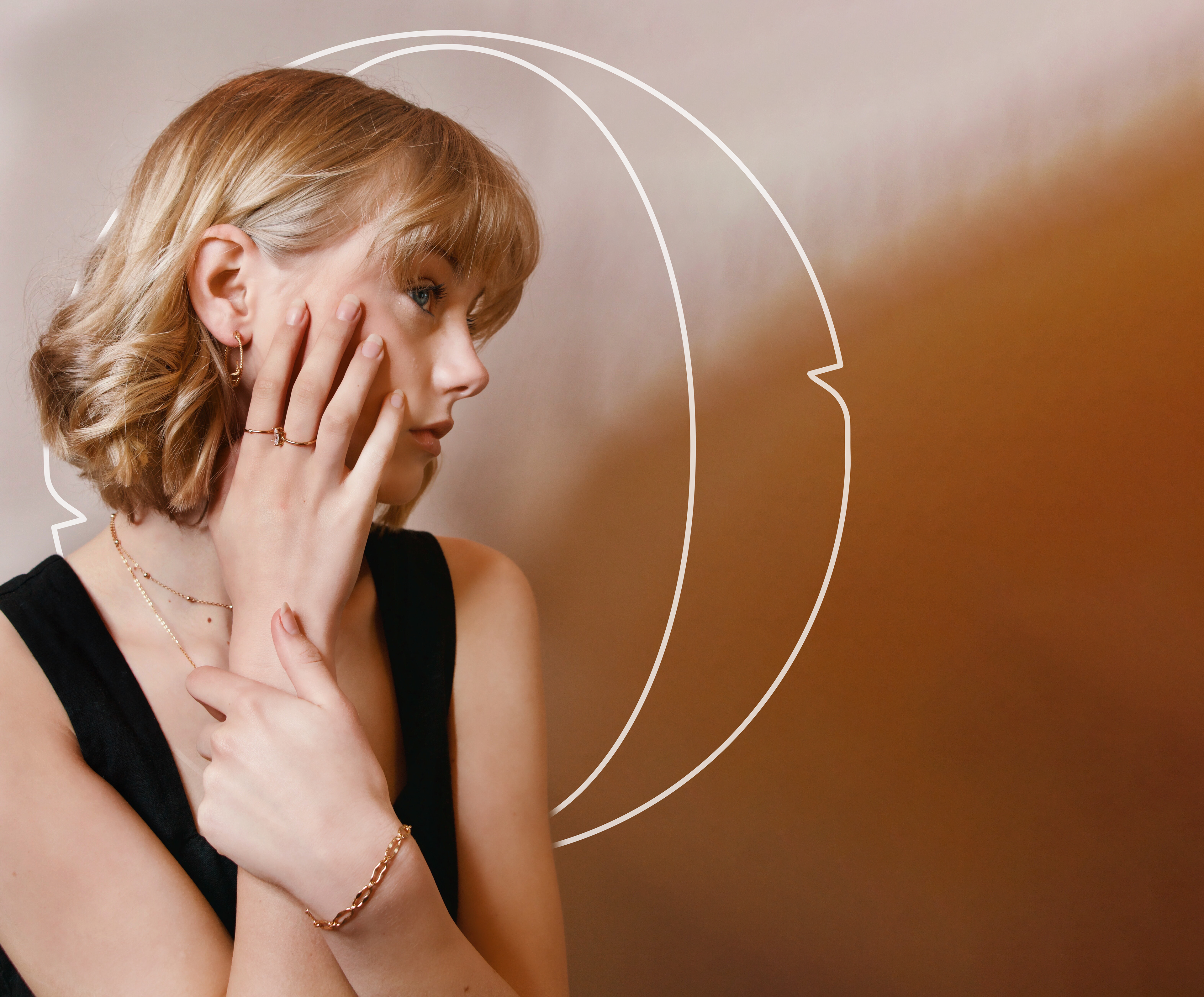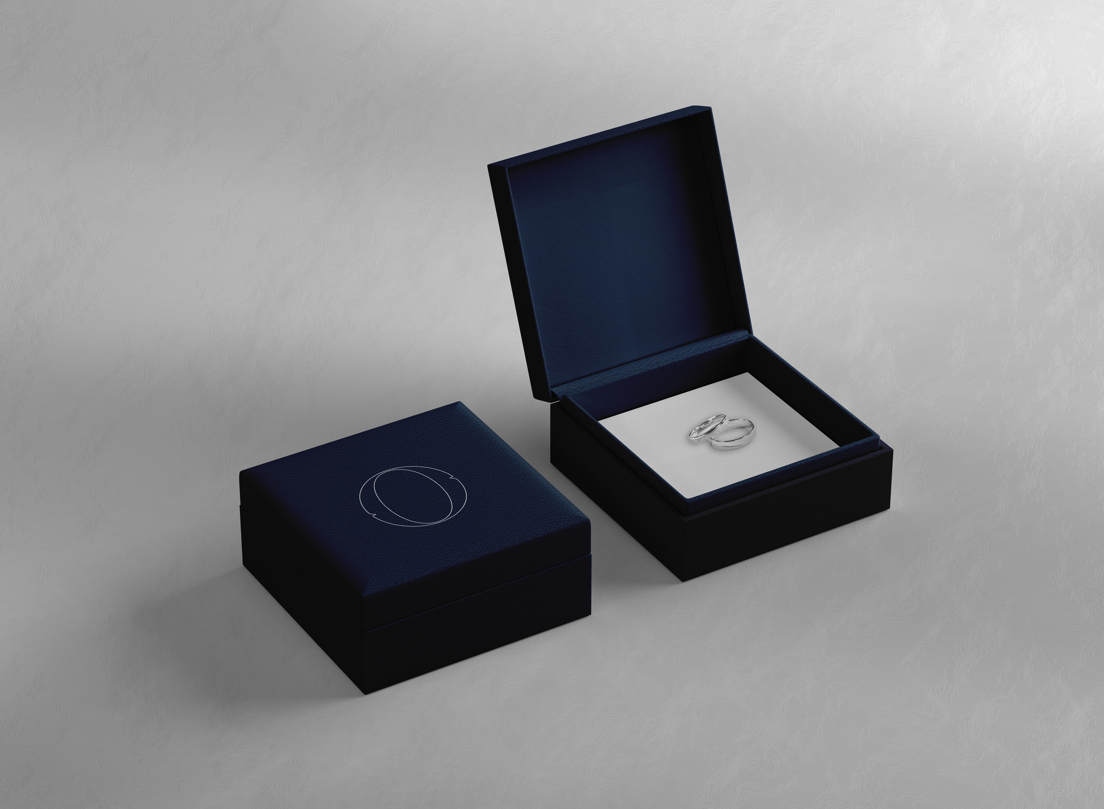
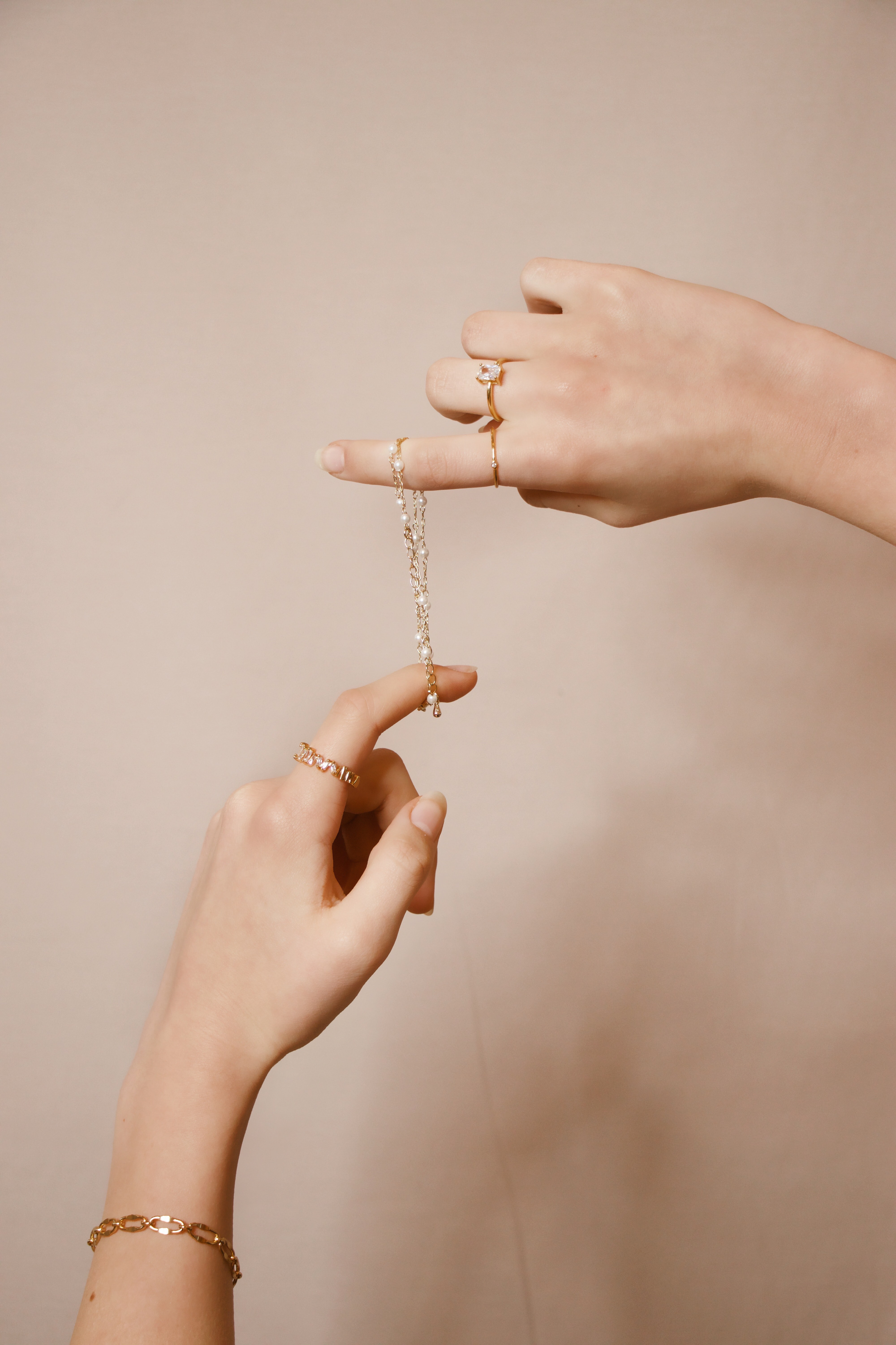
Outrora is a brand that manufactures exclusive jewelry, completely designed for the final costumer, from the 3D design to the final packaged delivery.
A jewel carries the meaning of a gift, which is the most important thing for the company. Jewels are eternal, the best gift you could get for someone you love, or gift someone you love. And if this is done with care and attention, been able to tell a story through the details of a piece, it gets even better.
The name brings a bit of the history of the founder: since he was a child he has been involved in jewelry on behalf of his mother and because it is a very old ancient art, it comes from “Outrora” - brazilian portuguese word that means another times.
stunning exclusive elegant delicate artistic emotional
moodboard:
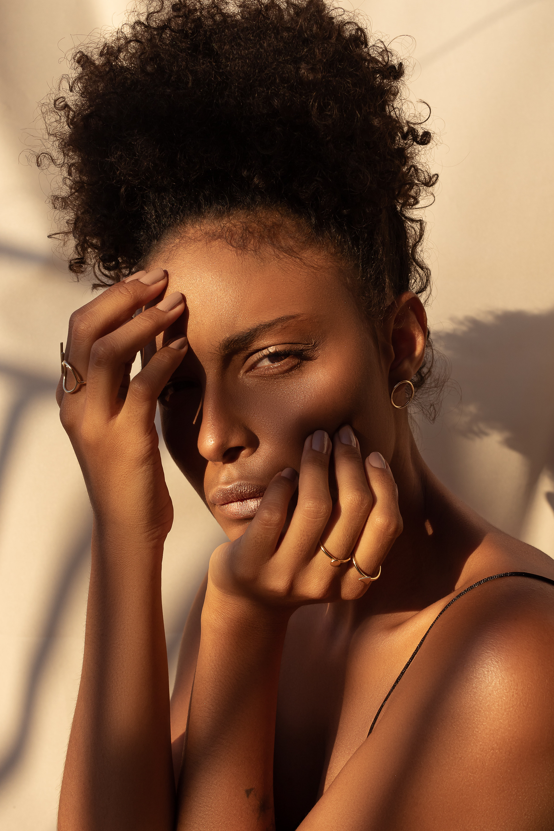
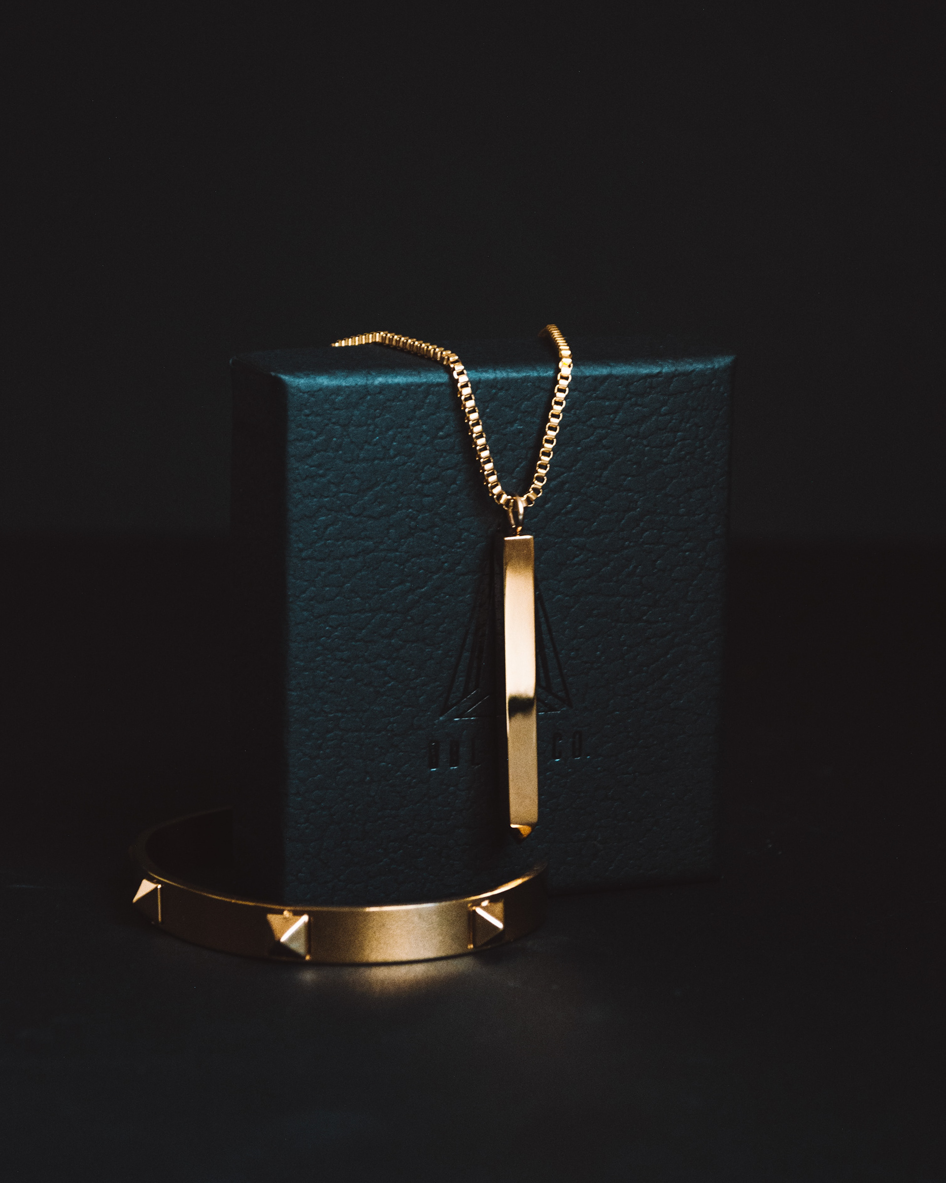
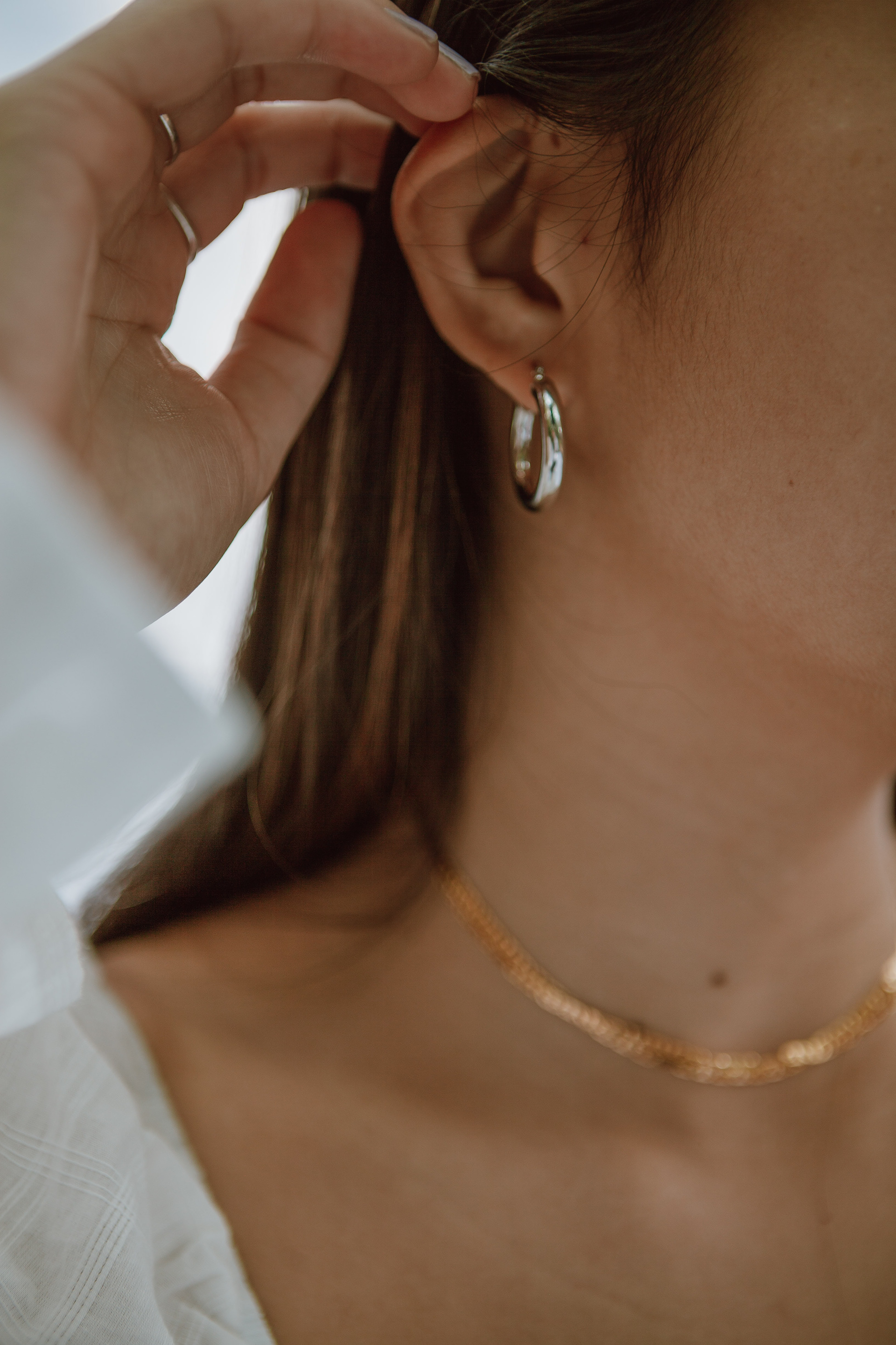
The colors of Outrora reflect the aspects that the brand wants to convey: elegance, splendor and exclusivity.
The shades of blue carry a little of the history of color: for the production of ultramarine, used as pigment a semi-precious stone called lapis lazuli, deep blue in color - found in gold and silver deposits.
As secondary colors, shades of gray and beige to unite silver and gold - one a little more sober but which mirrors the attributes of Outrora.
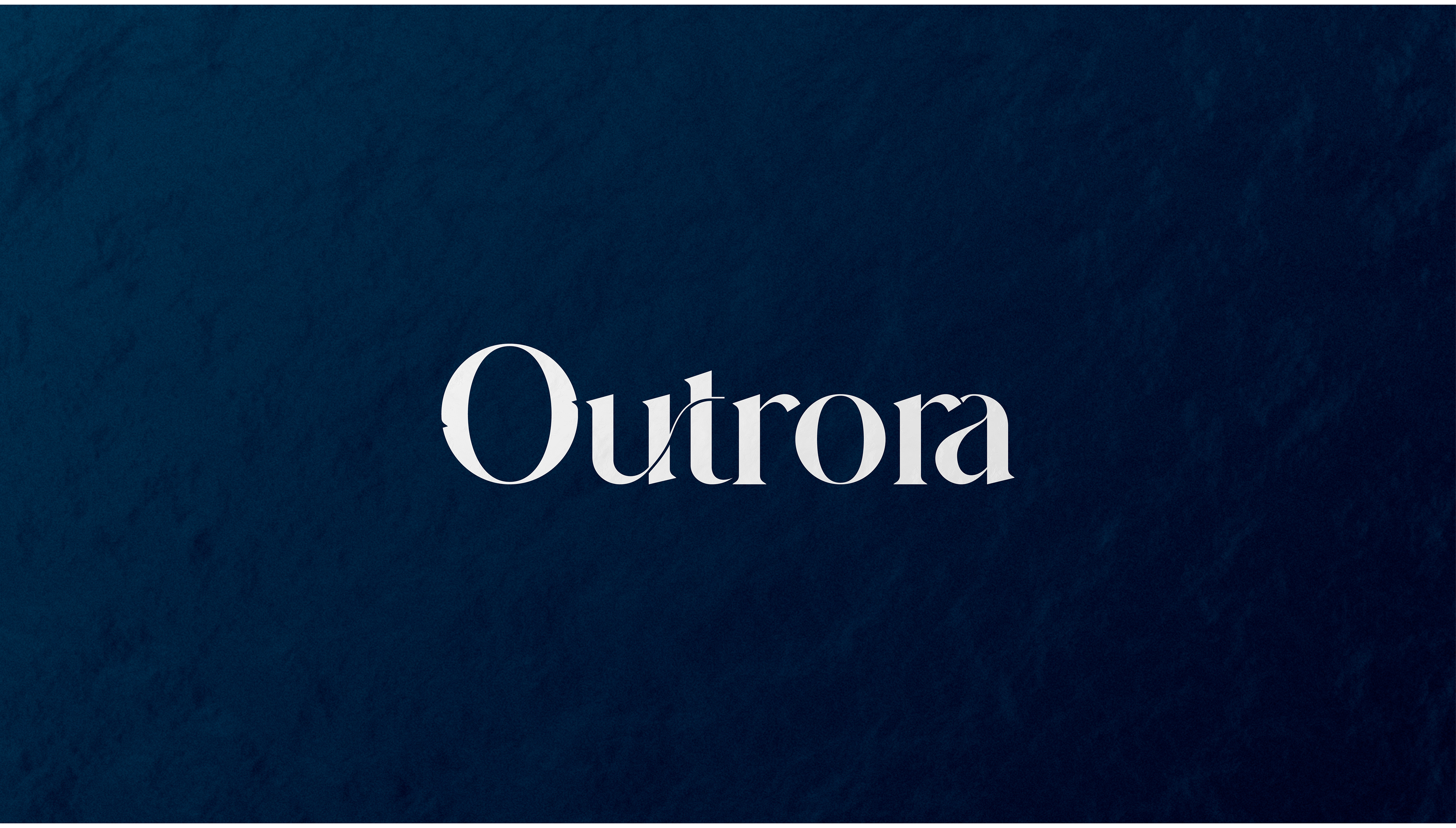
All conceptualized in being a name brand, the choice of typography was a very important decision for the conception.
The ligatures bring something very important in the making of jewelry: the union of small alloys to form the adornment.
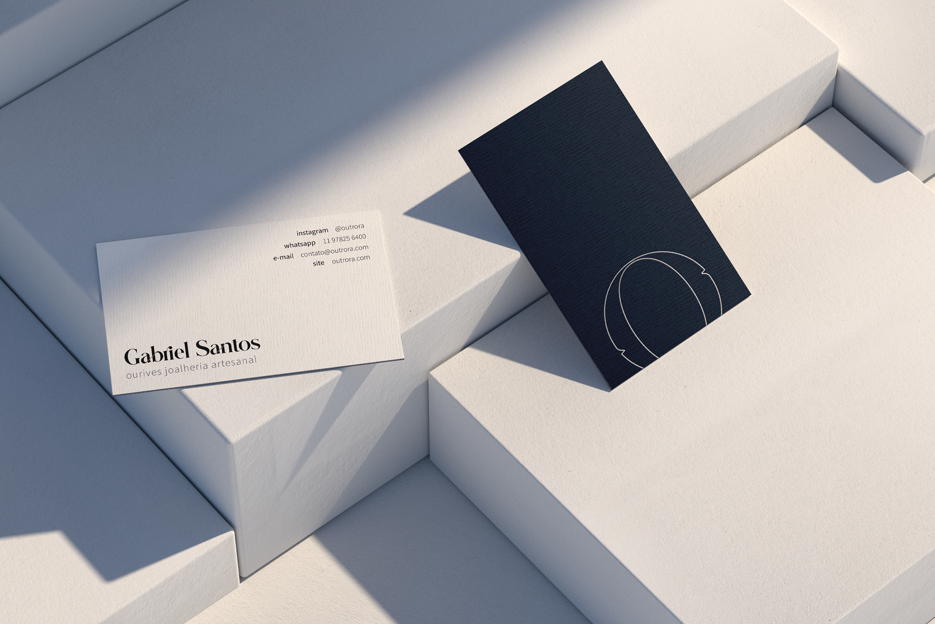
Along with the typography and inspired by the client's idea, a small detail was added to the letter “O”: the serif of the letter “U” in negative space on both sides of the initial. The letter "O" ceases to be just a letter and becomes a striking symbol for the former.
